
About Takashi Murakami's Limited Editions
, 14 min reading time
, 14 min reading time
Takashi Murakami's limited editions span a remarkably wide range of themes, sizes, techniques, and print runs, and that variety is precisely what keeps his collector base so large and so loyal.
Most of his output consists of offset lithographs produced in editions of 300, each distinguished by different finishing treatments. Whether the subject is Mr. DOB, Kaikai Kiki, the smiling flowers, colorful skulls, Flower Balls, or one of his many self-portraits, the full breadth of Murakami's iconography is accessible to collectors through his graphic work.
At Artetrama we have been handling Murakami's editions for more than ten years, and over that time three questions have come up more than any others: How should I read the date? Why do the signatures look so different? And what exactly are all those printing techniques? This article addresses each one in turn.
A few recurring specifications help orient anyone navigating the catalog. Most offset lithographs come in editions of 300 and are often enhanced with cold foil, hot foil, silver layers, spot or high-gloss UV varnish, and, on select releases, Diasec acrylic mounts. These finishing choices explain why two prints bearing the same image can look and feel radically different once they are on a wall. Flower Ball, Mr. DOB, Kaikai Kiki, and the skull motifs serve as anchors across a vast body of work, while periodic pigment prints and silkscreens offer higher tactile relief and denser color planes for collectors who prioritize material presence.
Not every edition follows the 300-copy standard, however. Silkscreens are typically issued in runs of 50 to 100 and are produced by hand, making them scarcer and, as a rule, more expensive. Archival pigment prints, such as A Fork in the Road (2020), are likewise limited to around 100 copies, printed on heavyweight Canson Velin Cotton Rag paper with deckled edges. Understanding these distinctions matters, because edition size and production method directly affect both rarity and secondary-market value.
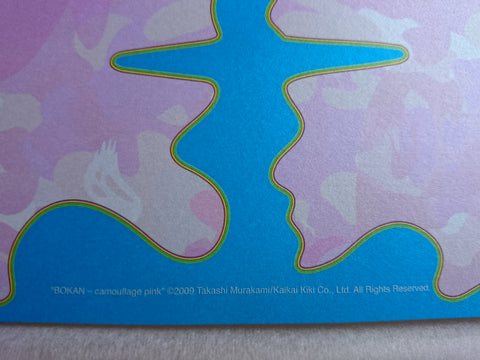
Every print Murakami has published carries, in addition to his signature and edition number, a copyright inscription along the bottom edge that includes the title and a year. That year refers to when the underlying image was first created and registered, not when the print itself was released. Galleries and auction houses cite the publication year of the limited edition, and it frequently differs from the copyright year. Their listing reflects when the edition was produced; the copyright line may point to an image that is years older.
For cataloging and insurance purposes, best practice is to record both the edition publication year and the image copyright year. Doing so avoids confusion when the image predates the print release, and it keeps your records aligned with the way auction houses and condition reports describe these works.
On offset lithographs, Murakami typically signs and numbers each impression on the front, in the lower-right margin, using ink (black, silver, or white, depending on contrast with the image). His notation follows a standard format (e.g. 123/300). This convention has remained consistent across most offset runs; what changes over the years is the style of the autograph itself, not where or how it is applied. On the archival pigment prints and serigraphs introduced from 2020 onward, the signature is sometimes executed in pencil rather than ink.
All of Murakami's graphic work is signed and numbered by the artist himself. Sooner or later, any collector who compares prints from different periods will notice something unexpected: the signatures look nothing alike. Murakami's autograph has undergone several distinct transformations over the past two decades.
In his earliest editions he simply wrote his given name, Takashi, followed by the year. Between 2001 and 2004 this relatively legible script became progressively more fluid. A first major shift arrived in 2005, when the handwritten name gave way to a wavy line. That linear form tended to flatten over time but remained broadly recognizable through 2010, a period during which it proved conveniently quick as the studio's output was growing rapidly.
By 2010, Murakami was signing upwards of 15,000 prints a year, compared with roughly 6,000 a few years earlier. A simpler, faster autograph was not merely a stylistic choice; it was a practical necessity.
That wavy line held until 2011, when early releases from that year reveal a transitional form that is part line, part loop. Before long, the loops took over entirely, producing the bold, rounded signature that has dominated his offset editions ever since. Then, in 2020, another change appeared, though only on his new archival pigment prints and serigraphs: the autograph returns to a linear stroke interspersed with small graphic elements.
Signatures and numbering typically sit on the front, in the lower margin (right-hand side), with edition annotations such as "xxx/300" varying by series. If authenticity is in question, request close-up photographs taken under raking light; this reveals pressure, stroke order, and ink sheen, details that are extremely difficult to replicate convincingly.
 And then, and then and then and then and then (2006) |
 Kansei: Korin Red Stream (2010) |
 Flower Ball: Burning Blood (2018) |
 A Fork in the Road (2020) |
Although the inner workings of the Kaikai Kiki factory remain largely opaque, several techniques recur across the editions. Most prints start as offset lithographs in runs of 300, but many layer additional processes on top of that base: cold or hot foil stamping, silver, and UV varnish. Who's Afraid of Red, Yellow, Blue and Death (2011, run of 300) is a textbook example, combining offset printing with silver and UV varnish to produce a surface that shifts between matte and mirror-like depending on the viewing angle.
Hot foil stamping works by pressing a metallic foil onto the paper with heat and a shaped die, producing sharp, clean edges and a faint embossed texture. Cold foil takes a different approach: a metallized film is bonded to the sheet with a UV-curable adhesive, effectively treating it like an ink. Because that adhesive can be applied in variable densities, cold foil lends itself to gradients and halftones in a way that its hot counterpart cannot easily match.
Cold foil is what accounts for the luminous gold and silver backgrounds Murakami favors — grounds that deliberately echo the gold-leaf screens of the Rinpa tradition in classical Japanese painting. Works such as The Golden Age: Hokkyo Takashi and Kyoto: Korin show these metallic grounds at their most striking. Silver replaces gold in other series, producing a cooler, pearlescent sheen visible in the And then… family, in self-portraits such as I Met a Panda Family and A Space for Philosophy, and in the diptych Homage to Francis Bacon (Study for Head of Isabel Rawsthorne and George Dyer).
A quick material note for collectors weighing up two prints side by side: cold foil is applied inline with a UV-curable adhesive and can be overprinted, allowing metallic color gradients that shift under changing light. Hot foil is applied offline with heat and a die, yielding crisper edges and, where desired, a lightly embossed surface. Both appear across Murakami's output, but cold foil's capacity for smooth gradation best explains the shimmering gold and silver grounds collectors associate with his work.
 Cold Foil Detail – The Golden Age: Hokkyo Takashi (2016) |
 Silver Layer Detail – I Met a Panda Family (2013) |
Checking the autograph is an important first step, but seasoned collectors look further. Prints acquired through official channels — Gagosian Gallery, Galerie Emmanuel Perrotin, Kaikai Kiki Gallery, Hidari Zingaro, Tonari no Zingaro, or the Tonari no Zingaro web store — arrive with a distinctive multi-layer packaging system that functions as a reliable provenance indicator in its own right.
An authentic Kaikai Kiki shipment follows a specific sequence: the print is wrapped in glassine tissue, then thick plastic, then cardboard, then two polystyrene layers, before being placed inside an inner box and finally an outer shipping box. Every layer carries the Kaikai Kiki Co., Ltd. logo, and the exterior is sealed with custom "fragile" stickers featuring Murakami's own characters. Inside the package, a Japanese-language invoice (納品書), issued by Hidari Zingaro or Tonari no Zingaro, accompanies the print. Of all these elements, the shipping labels showing Kaikai Kiki's return address alongside the buyer's destination are widely regarded as the strongest single proof of provenance.
One detail that catches new collectors off guard: Kaikai Kiki does not normally issue a Certificate of Authenticity with prints sold through its standard distribution channels. A COA may appear in specific cases (purchases made through the MOCA, for example), but its absence is the norm and should not, on its own, raise concerns when every other provenance element checks out.
Even though these are relatively recent works, Murakami's editions are not immune to environmental damage. Humidity, direct sunlight, and excessive heat can cause warping, foxing, or fading, and the risk is particularly acute for prints with heavy UV varnish or metallic foil treatments, where the surface finish is integral to the visual experience. Anyone buying on the secondary market should inspect carefully for creases, corner dings, and any bubbling or delamination in the foil or varnish layers. Because these finishes are so central to how the work reads, even minor surface damage can have a disproportionate effect on value.
Murakami's output is so broad and varied that becoming an expert is a genuine challenge, but that same breadth gives collectors plenty of room to build a focused, personal selection.
A practical approach is to begin with a Flower Ball or Mr. DOB offset that features foil or silver effects, then add a piece from the Kaikai Kiki universe for thematic breadth, and finally consider a screenprint or archival pigment work for the richer surface profile that only a smaller-run, hand-finished piece can deliver. Offsets in runs of 300 offer the greatest liquidity on the secondary market, while silkscreens and pigment prints in runs of 50 to 100 command higher prices thanks to their relative scarcity and handmade character.


